PP434 Portfolio

by Virgie Yuliana

HOME | LinkedIn | GitHub

Welcome to my PP434 portfolio for Automated Data Visualization for Public Policy. This section documents my weekly coding exercises, where I practice transforming raw data into clear, structured, and compelling visualizations. Each entry reflects an iterative learning process, focusing on the technical and design choices involved in effective data communication.

CC1 - Hosting. Display charts in your own site.

Task: Set up a GitHub account and live page using GitHub pages.
Add two charts using the vegaEmbed function.

Source: Economics Observatory


CC2 - Building. Create your own visualisations.

Task: Build two seperate charts using the "create" tool from Economics Observatory Data Hub.
Embed the two charts in your page using the VegaEmbed function.
Go to Create Tool

Code: Graph 1 | Graph 2


CC3 - Debate. Use a visualisation in policy commentary.

Task: 1. Set out a policy topic.
2. Produce two charts that support or refute or related to a topic of policy debate.
3. Comment on what you find from the charts.

UK Inflation and Economic Growth: Evidence from Three Decades
The Bank of England should maintain its 2% inflation target to avoid the economic contractions that historically accompany high inflation episodes.

Data confirms inflation spikes in 1990-91, 2008-09, and 2020-22 coincided with sharp GDP contractions—whether before, during, or after—validating low inflation targets.

Data Sourve: Inflation YoY (%) | GDP YoY (%) (Office for National Statistics)
Code: Graph 1 | Graph 2


CC4 - Replicate. Re-create, then improve, someone else's chart.

Task: 1. Find a chart create an image file of their chart.
2. Replicate their chart in Vega-Lite.
3. Improve their chart. Change the elements of the chart specification to make it better


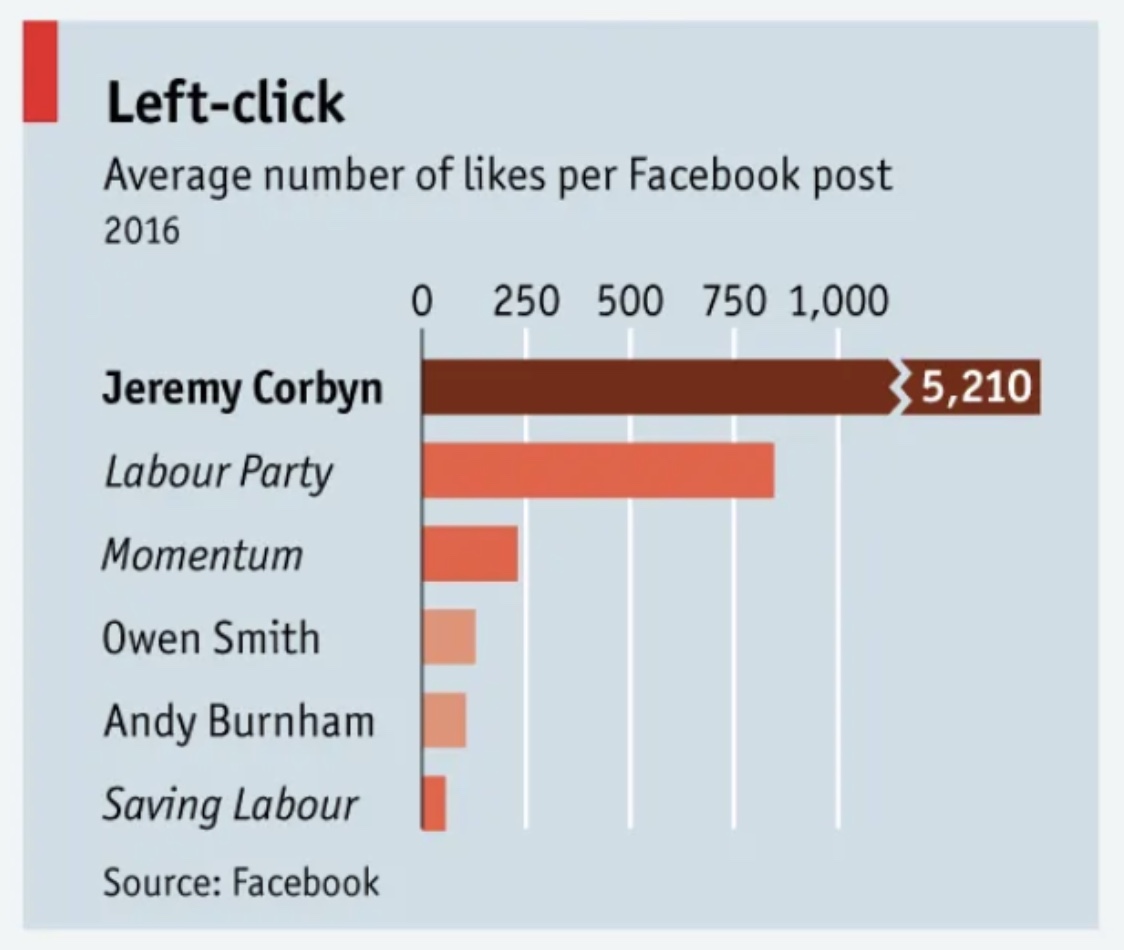
Chart Replication: Gender Distribution by Ethnicity
Source: The Economist

Version 1: Original Chart

Original Chart

Version 2: Replicated Chart


Version 3: Improved Chart
This improved version starts the axis at zero with consistent scaling, making the dramatic difference visible: Jeremy Corbyn's engagement was more than 7 times higher than the Labour Party's. A single color scheme replaces the original's unexplained multiple colors, which added confusion rather than clarity.


Code: Version 2 | Version 3


CC5 - Accessing Data. Scraper and API.

API Task: 1. Add a chart to your site that uses a live link to an API
2. Below your chart, add a functional description of the API.

API Functional Description: The World Bank API uses a base URL of "http://api.worldbank.org/v2/", followed by country/region codes, indicator code, and query parameters. For this chart, I used seven regional codes (EAS, ECS, LCN, MEA, NAC, SAS, SSF) representing major world regions, combined with indicator code SP.DYN.IMRT.IN for infant mortality rate per 1,000 live births. Three query parameters customize the data: (1) format=json returns JSON format, (2) per_page=500 retrieves sufficient records, and (3) date=1990:2050 specifies the year range while ensuring future updates are captured automatically.

The complete URL used:
http://api.worldbank.org/v2/country/EAS;ECS;LCN;MEA;NAC;SAS;SSF/indicator/SP.DYN.IMRT.IN?format=json&per_page=500&date=1990:2050 (This live API connection automatically updates when the World Bank publishes new data)

Code: CC5 API Task


Scraper Task: 1. Using a Google Colab phyton notebook, scrape a website.
2. Clean and normalise the data and export into TIDY format.
3. Create a chart using the cleaned data and embed it in your site using Vega.
4. Comment (not more than 25 words) on what you did.

For this chart, I scraped Premier League table from Wikipedia, cleaned data in Colab, exported to CSV on GitHub, visualized attack-defense balance using Vega-Lite diverging bars. View Google Colab Notebook

Code: CC5 Scraper Task


CC6 - Loops. Build a dashboard.

Task: 1. Use a loop to batch download six different series as JSON files.
2. Save these to your GitHub account and use these (as "raw" files) to supply the data to six (or more) charts on a theme of your choice.
3. As above, use a loop in your Javascript in order to embed the six charts.

Southeast Asia Employment Dashboard (2000-2024)
Data: World Bank | Analysis: Google Colab Notebook | Code: Loop Code


CC7 - Maps. Base maps and choropleths.

Task: Produce two maps and embed them in your portfolio page.
One map should be of Scotland, and the other should be of Wales.
Integrate maps with data, one should be a coordinate map, the other a choropleth.

Coordinate Map
Data: Office for National Statistics (ONS) | Code: Coordinate Map

Choropleth Map
Data: Office for National Statistics (ONS) | Code: Choropleth Map


CC8 - Big Data. Extracting a story from millions of prices.

Task: 1. Produce two charts using UK prices datasets.
2. Explain, in no more than 50 words, what you have done.

Chocolate Price Dispersion
Code: Google Colab Notebook

Daily chocolate prices are simplified by grouping observations by week and supermarket. For each week, I compute the 25th and 75th percentiles across stores and plot the interquartile range, capturing how price dispersion evolves over time. This analysis explores the price dispersion of chocolate products across different retailers in the UK. By visualizing the price ranges and averages, we can identify pricing strategies and market positioning.


Whisky Price Deviations
Code: Google Colab Notebook

Daily whisky prices are reduced to store-level median prices using observations from the last 60 days. I then plot each supermarket’s deviation from the overall median price, highlighting cross-store differences in pricing strategies.


CC9 - Two Interactive Charts

Task: Produce two charts that include interactivity.

I created two interactive visualisations analysing the recovery of international visitor arrivals to Singapore following the COVID-19 shock, using monthly arrivals data by place of residence from the Singapore Department of Statistics (SingStat). The data were cleaned and reshaped in Python, and arrivals were indexed to a 2019 baseline (2019=100) to allow comparisons across markets and over time.
View notebook
.

The first chart is an interactive indexed line chart that allows users to toggle between market groups and metrics. It shows the sharp collapse in early 2020, followed by a gradual and volatile recovery after borders reopened in 2022. The chart highlights substantial differences in recovery dynamics across regions, particularly the more delayed and volatile rebound from Greater China compared to Southeast Asia.

The second chart is an interactive world choropleth map with a quarterly slider, enabling users to explore how recovery evolved geographically over time. The map reveals that recovery was highly uneven in the early reopening phase: by 2021Q4, Bangladesh, India, and Myanmar showed the earliest signs of recovery, while most other countries remained close to zero. This spatial pattern underscores the role of asynchronous border policies and regional mobility in shaping Singapore’s tourism recovery.


CC10 - Advanced Analysis and Machine Learning

Task:1. Produce a chart that uses more advanced analytics that standard line, bar or scatter charts.
2. Conduct an applied data analysis using any of the machine learning techniques taught.

Advanced Analysis Chart
Code: Google Colab Notebook

Hypothesis: Singapore's tourism recovery exhibits systematic variation: markets with larger pre-pandemic shares demonstrate lower recovery performance, creating a strategic portfolio tension between volume and growth.
Finding: Southeast Asia and Greater China (60% of 2019 arrivals) underperform at 82-87% recovery, while smaller markets exceed 100%, confirming an inverse volume-performance relationship.


Machine Learning Analysis
Code: Google Colab Notebook

Hypothesis: Singapore's source markets cluster into distinct recovery archetypes based on performance, speed, volatility, and market size, requiring differentiated tourism policy approaches.

X Matrix Transformation:
Input: 9 regions × 5 features (current recovery index, time to 50%, volatility, 2019 market share, growth slope)
Standardization: Z-score normalization using sklearn.preprocessing.StandardScaler
Output: Standardized feature matrix for clustering analysis.

Finding: K-means identifies three segments: Slow Giant (China, 38-month recovery), High-Volume Laggards (SE/South Asia, 84.7% performance), Diverse Performers (six regions, 96.3% average). Silhouette score: 0.269.